Appearance
Date Selector Component
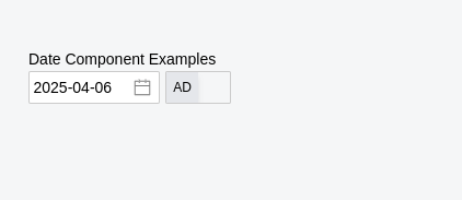
This component provides a Date Selector Field with AD/BS toggle functionality, allowing users to input dates in both Gregorian (AD) and Nepali (BS) calendars. The component uses Vue DatePicker for AD dates and Nepali DatePicker for BS dates.
Props
| Prop Name | Type | Default | Description |
|---|---|---|---|
modelValue | String | "" | The currently selected AD Date in YYYY-MM-DD format |
classValue | String | "" | Class for datepicker input fields |
isBS | Boolean | false | Whether to show the date in BS format by default |
defaultDate | Boolean | false | Whether to set default today on load |
showToggle | Boolean | true | Whether to show the AD/BS toggle button |
disabled | Boolean | false | Whether the date input is disabled |
Emitted Events
| Event Name | Payload | Description |
|---|---|---|
update:modelValue | String | Emitted when the selected date changes |
update:isBS | Boolean | Emitted when the calendar format is toggled |
Example Usage
vue
<template>
  <div>
    <h1>Date Component Examples</h1>

    <!-- Basic usage -->
    <DateSelector v-model="date" />

    <!-- With custom width -->
    <DateSelector v-model="date" classValue="w-full" />

    <!-- Start in BS mode -->
    <DateSelector v-model="date" :isBS="true" />

    <!-- Without toggle button -->
    <DateSelector v-model="date" :showToggle="false" />

    <!-- Disabled state -->
    <DateSelector v-model="date" :disabled="true" />
  </div>
</template>

<script setup>
import { ref } from 'vue';

const date = ref('2025-04-06');
</script>
Screenshot
Notes
- Ensure the
v-modelprop is always passed to enable two-way data binding and is always in AD - The component always stores and emits dates in AD format (
YYYY-MM-DD), even when displaying in BS