Appearance
Input Error Directives
v-input-error
A custom Vue directive to visually display input validation errors by appending an error message and styling the input field with red borders.
Props (Binding Value)
| Type | Required | Example | Description |
|---|---|---|---|
string | No | 'This field is required' | The error message to show. If falsy, error styles and messages are removed. |
Bound using
v-input-error="errorMessage"whereerrorMessageis a string or falsy.
Slots
N/A (used as a directive, not a component).
Emits
None (directives do not emit events).
Functions
handleErrorMount(el, binding)
- Triggered on initial mount.
- If
binding.valueexists:- Adds
.border-red-500class to the<input>insideel. - Adds
.border-red-500class to the container element. - Appends an error
<span>with classestext-red-500,text-[12px], anderror-messagecontaining the error message.
- Adds
handleErrorUpdate(el, binding)
- Triggered when the bound value updates.
- Behavior:
- If
binding.valueis truthy and no error message exists:- Creates a new error message element.
- Adds
.border-red-500class to the input.
- If
binding.valueis truthy and error message exists:- Adds
.input-errorclass to the container. - Adds
.border-red-500class to the input. - Updates the error message text.
- Adds
- If
binding.valueis falsy:- Removes
.input-errorclass from the container. - Removes
.border-red-500class from the container and input. - Removes the error message element.
- Removes
- If
Usage
vue
<template>
<div class="form-field" v-input-error="errorMessage">
<label>Username</label>
<input
v-model="username"
type="text"
placeholder="Enter username"
/>
</div>
</template>
<script setup>
import { ref, computed } from 'vue';
const username = ref('');
const hasError = computed(() => username.value.length < 3);
const errorMessage = computed(() =>
hasError.value ? 'Username must be at least 3 characters' : ''
);
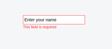
</script>Screenshot
Styling
The directive applies these Tailwind CSS classes:
.flex&.flex-colto the the element to align properly.border-red-500to both the container and input elements when an error is present.text-red-500and.text-[12px]to the error message.input-errorto the container element when updating with an error
Notes
- Looks for an
inputinside the bound element to apply border styling. - Appends a
<span>with the error message at the end of the container. - Automatically cleans up error UI when value becomes falsy (e.g.,
null,'',undefined). - Adds
.error-messageclass to help target or style error messages. - Best use case is to return errors that the backend validation sends.