Appearance
WizardStepper Component
A flexible, clickable stepper used to visually represent and navigate multi-step workflows such as forms or wizards.
Props
| Prop Name | Type | Default | Description |
|---|---|---|---|
totalSteps | number | 4 | Total number of steps to render. |
currentStep | number | 1 | The currently active step (1-based index). |
className | string | "" | Optional custom classes for the container. |
stepLabels | array<string> | null | Optional labels for each step. Displayed below the stepper circles. |
onStepChange | `function | null` | null |
Emits
| Event Name | Description |
|---|---|
step-change | Emitted when a step circle is clicked. Passes the clicked step number as a parameter. |
Slots
None
Functions
| Function Name | Description |
|---|---|
handleStepClick(stepNumber: number) | Emits step-change and calls onStepChange if provided when a step is clicked. |
getStepClasses(stepNumber: number) | Returns class names based on the step's current status (past, current, or future). |
getBarClasses(stepNumber: number) | Determines color/style of the progress bar between steps. |
getBarWidth(stepNumber: number) | Returns the width for the filled section of the progress bar. |
Usage
Basic Usage
vue
<template>
<div class="w-[900px] mx-auto mt-[100px]">
<Wizard
:total-steps="5"
:current-step="currentStep"
:step-labels="['Setup', 'Config', 'Review', 'Deploy', 'Done']"
@step-change="handleLabeledStepChange"
/>
<div class="mt-4 flex gap-2">
<button
@click="prevLabeledStep"
:disabled="currentStep <= 1"
class="btn"
>
Previous
</button>
<button
@click="nextLabeledStep"
:disabled="currentStep >= 5"
class="btn"
>
Next
</button>
</div>
<p class="mt-2 text-sm text-gray-600">
Current Step: {{ currentStep }} -
{{ ["Setup", "Config", "Review", "Deploy", "Done"][currentStep - 1] }}
</p>
</div>
</template>
<script setup lang="ts">
import { ref } from "vue";
const currentStep = ref(1);
const handleLabeledStepChange = (step: number) => {
currentStep.value = step;
};
const nextLabeledStep = () => {
if (currentStep.value < 5) {
currentStep.value++;
}
};
const prevLabeledStep = () => {
if (currentStep.value > 1) {
currentStep.value--;
}
};
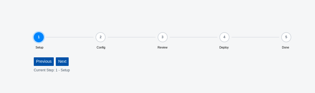
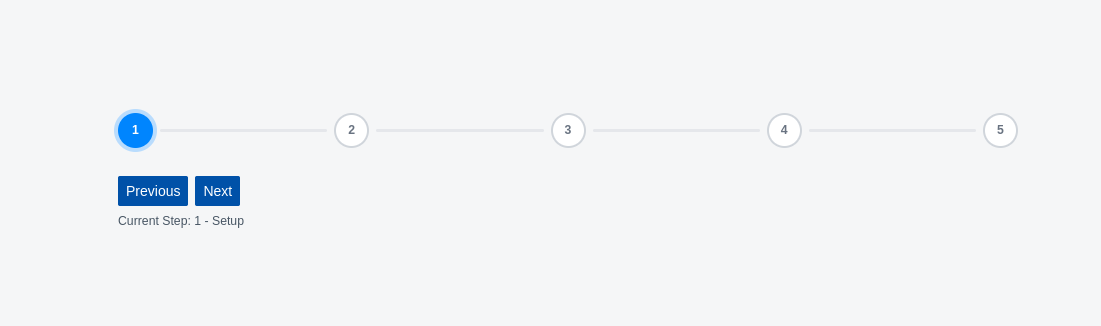
</script>Screenshot
- With Lable
- Without Lable
Notes
- Steps are interactive when
onStepChangeis provided. - Supports custom step labels shown below each step.
- Responsive and fully styled with transition animations.
- Automatically applies active, completed, and inactive styles based on current step.
- Emits events on user interaction, allowing external step management.
- Custom styling can be injected via
classNameprop.