Appearance
Icon Component
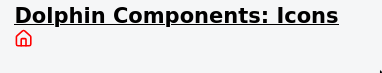
This component dynamically renders icons from lucide-vue-next. It takes an icon name as a prop and maps it to the corresponding Lucide icon component.
Props
| Prop Name | Type | Default Value | Description |
|---|---|---|---|
name | string | undefined | The name of the Lucide icon to render. |
size | number | 16 | Icon size in pixels. |
color | string | "currentColor" | The color of the icon. |
strokeWidth | number | 2 | Thickness of the icon's strokes. |
absoluteStrokeWidth | boolean | false | Whether to apply absolute stroke width. |
classValue | string | "" | Additional CSS classes for styling. |
opacity | number | 1 | Transparency of the icon |
How to Use This Component
To use it, just import the component then define it:
vue
<Icon name="Home" size="24" color="blue" />How to know the name of the icon
You can search on: Lucide's docs
NOTE: You need to change the name while searching from test-name to TestName (First letter capital, then remove any - and replace succeeding character with its uppercase version)
For refresh-cw icon it is:
Screenshot
Notes
- Ensure the
nameprop is always passed: