Appearance
Modal Component
The Modal component provides a modal dialog with a title, content area, and customizable actions. It includes a transition effect for smooth entry and exit animations.
Props
| Prop Name | Type | Default | Description |
|---|---|---|---|
title | Array<{ name: string; link?: string }> | [] | The title of the modal, displayed as breadcrumbs. Each item can be plain text or a link. |
actions | Array<{ title: string; emit: string; class?: string }> | [] | A list of action buttons, each emitting a specified event when clicked. |
show | boolean | false | Determines whether the modal is visible or not. |
width | string | '600px' | The width of the modal. |
showClose | boolean | true | Show or Hide Close Button at top |
Slots
| Slot Name | Description |
|---|---|
default | The main content body of the modal. |
Emits
| Event Name | Payload Type | Description |
|---|---|---|
onClose | void | Emitted when the modal is closed. |
customEventName | `string | number` (optional) |
Functions
handleAction(action: ModalAction): void
Handles the action button click. It emits the corresponding event based on the emit property of the action.
- Parameters:
action(ModalAction): The action button object containing theemitproperty, which determines the event to be emitted.
checkHeight(): void
Checks the height of the modal’s content area (dynamicDiv) and adjusts the shouldApplyOverflow property based on the content's scroll height relative to the available screen height.
- Usage: Ensures that if the modal content exceeds the available height, the overflow behavior is applied.
handleResize(): void
Handles window resize events. It recalculates the screen height and checks whether the modal content requires overflow behavior.
onMounted()
Called when the component is mounted. It checks the height of the modal content and adds the resize event listener to the window.
onUpdated()
Called after the component is updated. It checks the height of the modal content again.
onBeforeUnmount()
Called before the component is unmounted. It removes the resize event listener from the window.
watch(screenHeight, checkHeight)
Watches for changes in the screen height and rechecks the modal content's height accordingly.
Usage Example
vue
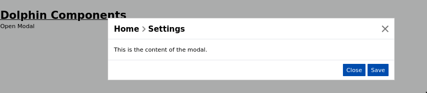
<template>
    <Modal
        :title="[
            { name: 'Home', link: '/' },
            { name: 'Settings' }
        ]"
        :actions="[
            { title: 'Close', emit: 'onClose' },
            { title: 'Save', emit: 'saveAction', class: 'btn' }
        ]"
        :show="showModal"
        width="700px"
        @onClose="handleClose"
        @saveAction="handleSave"
    >
        <template #default>
            <p>This is the content of the modal.</p>
        </template>
    </Modal>
</template>

<script setup>
import { ref } from 'vue';

const showModal = ref(**true**);

const handleClose = () => {
    showModal.value = false;
};

const handleSave = () => {
    console.log("Saving data...");
};
</script>
If you import this elsewhere, that'd be:
vue
<template>

	<main>

		<h1 class="text-3xl font-bold underline">
			Dolphin Components
		</h1>

		<button @click="toggleModal" class="btn-primary">Open Modal</button>
		<modal :show="showModal" @onClose="showModal = false" @saveAction="handleSave" />

	</main>

</template>
Screenshot
Notes
The
titleprop allows breadcrumb-style navigation within the modal.The
actionsprop dynamically generates buttons that trigger events likeonCloseor custom events.The modal has an animation effect applied during its entrance and exit (
modal-loadtransition).The component provides a
defaultslot for inserting custom content inside the modal.