Appearance
Tooltip Directive
v-tooltip
A custom Vue directive that shows a tooltip with specified content on hover, dynamically positioning it relative to the element based on available viewport space.
Props (Binding Value)
| Type | Required | Example | Description |
|---|---|---|---|
Object | Yes | { content: 'Tooltip text', raw: false, preferredPosition: 'top' } | Configuration object specifying tooltip content and options |
The binding value is an object with the following optional properties:
content(string, required): The text or HTML content to display inside the tooltip.raw(boolean, default: false): Whether to render content as raw HTML.preferredPosition(string, default: 'top'): Preferred tooltip position ('top' | 'bottom' | 'left' | 'right').
Modifiers
N/A
Arguments
N/A
Slots
N/A (used as a directive, not a component)
Emits
N/A (directives do not emit events)
Functions
hasSpace(position, elRect, tooltipRect)
Checks if there is enough space in the viewport to display the tooltip at the given position relative to the element.
Parameters:
position— Position to check ('top' | 'bottom' | 'left' | 'right').elRect— Bounding rectangle of the target element.tooltipRect— Bounding rectangle of the tooltip element.
showTooltip()
- Creates and mounts the tooltip component.
- Calculates the best position for the tooltip, falling back to alternatives if the preferred position lacks space.
- Positions the tooltip absolutely on the page.
- Shows tooltip after a short delay to avoid flicker.
hideTooltip()
- Unmounts and removes the tooltip from the DOM.
- Clears any pending tooltip show timeouts.
delayedShowTooltip()
- Starts a short timeout (200ms) before showing the tooltip, to prevent flickering on quick mouse movements.
Usage Example
vue
//Default Load Example
<template>
<button v-tooltip="{ content: 'Save changes', preferredPosition: 'right' }">
Save
</button>
</template>
//HMTL Element Load Example
<template>
<button
v-tooltip="{
content: tooltipHtml,
raw: true,
preferredPosition: 'right',
}"
class="btn"
>
Hover Me
</button>
</template>
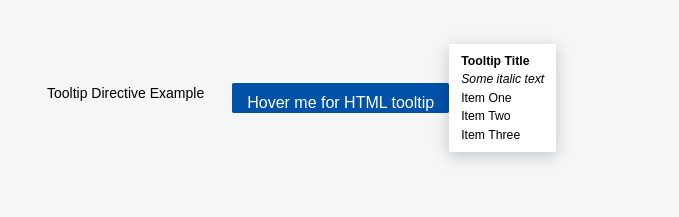
<script lang="ts" setup>
const tooltipHtml = `
<div>
<strong>Tooltip Title</strong><br/>
<em>Some italic text</em><br/>
<ul>
<li>Item One</li>
<li>Item Two</li>
<li>Item Three</li>
</ul>
</div>
`;
</script>Behavior Summary
- Tooltip shows on
mouseenterwith a 200ms delay. - Tooltip hides immediately on
mouseleave. - Tooltip content can be raw HTML or plain text.
- Tooltip automatically positions itself based on available viewport space.
- Cleans up event listeners and tooltip elements on unmount.
Notes
- Tooltip content is mounted as a separate Vue app instance attached to a dynamically created
<div>. - Supports dynamic positioning fallback if preferred position is not feasible.
- Uses high
z-indexto stay visible above other elements. - Tooltip DOM nodes are cleaned up to prevent memory leaks.
Screenshot