Appearance
Tabulator Component
A powerful data table component built on top of Tabulator-tables, providing features like remote/local pagination, filtering, column settings, printing, and exporting.
Props
| Prop | Type | Default | Description |
|---|---|---|---|
data | TabulatorData[] | [] | Data for the table (used in local mode) |
columns | TabulatorHeader[] | [] | Column definitions |
placeholder | string | "" | Text to display when there is no data |
paginationSize | number | 25 | Number of rows per page |
paginationSizeSelector | number[] | [10, 25, 50, 100] | Available page sizes in the selector |
action | boolean | false | Whether to enable the built-in action column |
actionButtons | TabulatorAction[] | [] | Global actions for the action column |
heightOffset | number | 250 | Offset to subtract from window height for table scroll area |
actionMode | "frontend" | "api" | "frontend" | Source of actions (static props vs dynamic data) |
showOptions | boolean | true | Whether to show table options (settings, export, print) |
paginationType | "local" | "remote" | "local" | Whether to paginate on client or server |
apiEndpoint | string | "" | Endpoint URL for remote pagination |
apiInstance | AxiosInstance | - | Custom Axios instance for API calls |
queryParams | Record<string, any> | {} | Additional parameters for API requests |
settingsButton | boolean | true | Show/hide column settings button |
printButton | boolean | false | Show/hide print button |
exportButton | boolean | false | Show/hide Excel export button |
sheetName | string | "download" | Filename for exported Excel sheets |
headerContent | string | "" | Custom HTML content to show above the table |
footerContent | string | "" | Custom HTML content to show below the table |
enableHeaderPrint | boolean | true | Include headerContent in print view |
enableFooterPrint | boolean | true | Include footerContent in print view |
enableHeaderBlock | boolean | true | Render headerContent block |
enableFooterBlock | boolean | false | Render footerContent block |
enableSelection | boolean | false | Enable Data Table Selection Column |
disableFooter | boolean | false | Disable footer in tabulator |
Exposed Functions
| Function | Type | Description | Usage |
|---|---|---|---|
reInitializeTabulator() | Void | Reinitialize/Rerender Tabulator | Create a Tabulator reference variable and call the exposed function |
print() | Void | Print the table with current data | Call to trigger print dialog with table content |
exportTable() | Void | Export table data to Excel file | Call to download table data as XLSX file |
getSelectedData() | Array | Get selected data from table | Call to get selected data from table |
Data Modes
Local Mode (Default)
- All data is provided via the
dataprop - Filtering, sorting, and pagination happen client-side
- Best for smaller datasets that can be loaded entirely
Remote Mode
- Data is fetched from a server via API calls
- Requires
apiEndpointandapiInstanceprops - Supports server-side filtering, sorting, and pagination
- Automatically sends filter and sort parameters to the API
- Shows loading state during API requests
- Expected API response format:json
{
  "data": [...], // Array of table rows
  "meta": {
    "total": 100,      // Total number of records
    "last_page": 4     // Total number of pages
  }
}
Emits
| Event | Description |
|---|---|
onClose | Fired when the settings modal is closed without applying changes. |
onSave | Fired when settings are applied (e.g., visibility, page size). |
onDataFeteched | Fired when remote data is successfully fetched, returns meta information. |
[custom] | Emits custom events from action buttons (e.g., deleteRow, editUser). |
Note: Custom event names come from the
emitproperty inactionButtons.
Features
Core Features
Column Settings
Users can toggle visibility of optional columns via a settings modal. Mandatory columns (isNotMandatory: false) cannot be hidden.Column Search
Search/filter columns by name in the settings modal for easier management of tables with many columns.Pagination Size Selector
Change the number of rows per page using radio buttons in the settings modal.Action Buttons
Per-row dropdown buttons with customizable styling, generated either from props (frontendmode) or row data (apimode).
Export & Print Features
- Excel Export
Export table data to XLSX format with customizable sheet names. Uses SheetJS library for robust Excel file generation. - Print Functionality
Print tables with optional header and footer content. Configurable print settings for headers and footers. - Header/Footer Blocks
Display custom HTML content above and below the table with separate controls for visibility and print inclusion.
Interactive Features
Row Selection & Highlighting
Clicking a row highlights it with a gray background when actions are enabled (action: true).Smart Dropdown Positioning
Action dropdowns automatically position themselves to stay within table boundaries and adjust position based on available space.Click Outside Handling
Action dropdowns close when clicking outside the table, scrolling, or clicking on other table elements.Configurable Toolbar
Flexible header toolbar with individual controls for settings, print, and export buttons.
Responsive & Dynamic
- Responsive Height
Automatically adjusts table height usingwindow.innerHeight - heightOffset. - Dynamic Updates
Table automatically updates whendata,columns, orqueryParamsprops change. - Multiple Instance Support
Each component instance uses a uniquetableIDto avoid conflicts when multiple tables exist on the same page.
Remote Data Features
Server-side Operations
Supports remote filtering, sorting, and pagination whenpaginationType="remote".Loading States
Built-in loading state management for API requests with proper state handling.Error Handling
Graceful handling of API errors with automatic loading state cleanup.Header Filters
Live filter delay of 500ms for better performance with remote data.Data Fetch Events
EmitsonDataFetechedevent with metadata when remote data is successfully loaded.
Usage Examples
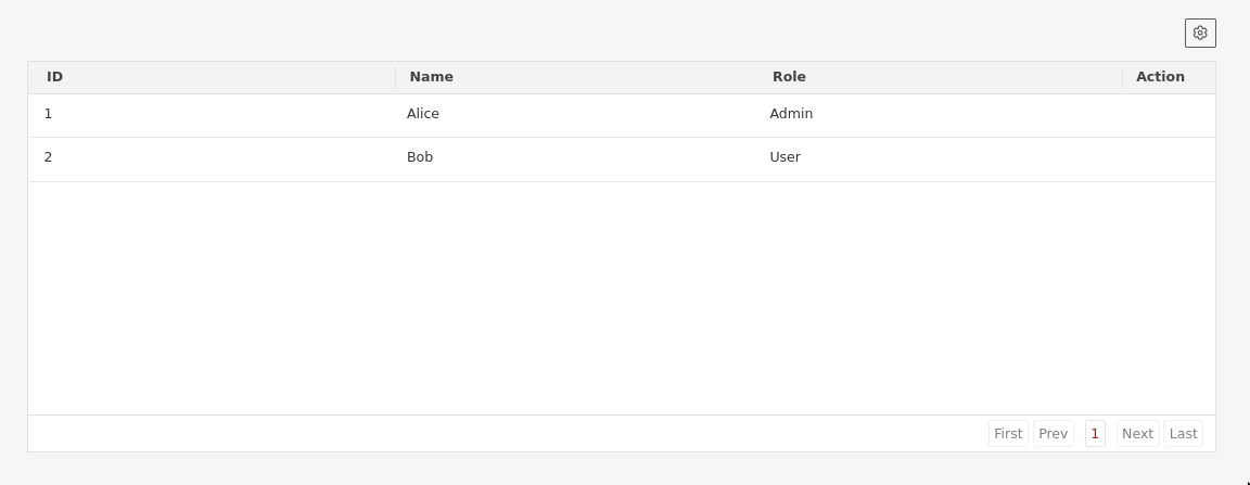
Basic Local Table
vue
<template>
  <Tabulator
    :data="data"
    :columns="columns"
    :pagination-size="25"
    :pagination-size-selector="[10, 25, 50, 100]"
    placeholder="No users found"
  />
</template>

<script setup>
const data = [
  { id: 1, name: "Alice", role: "Admin", email: "[email protected]" },
  { id: 2, name: "Bob", role: "User", email: "[email protected]" },
];

const columns = [
  { title: "ID", field: "id", isNotMandatory: true },
  { title: "Name", field: "name", isNotMandatory: false }, // Always visible
  { title: "Role", field: "role", isNotMandatory: true },
  { title: "Email", field: "email", isNotMandatory: true },
];
</script>
Data Select Table
vue
<template>
  <div class="p-4 space-y-8">
    <div>
      <h2 class="text-xl font-bold mb-4">
        Selectable Tabulator (Verification)
      </h2>
      <div class="mb-4">
        <button @click="logSelectedData" class="btn btn-primary">
          Log Selected Data
        </button>
      </div>
      <Tabulator
        :columns="selectableColumns"
        :data="selectableData"
        :enableSelectable="true"
        ref="selectableTabulator"
      />
    </div>
  </div>
</template>

<script setup lang="ts">
import { ref } from "vue";
const selectableTabulator = ref<any>();

const selectableData = [
  { id: 1, name: "Item 1", category: "A" },
  { id: 2, name: "Item 2", category: "B" },
  { id: 3, name: "Item 3", category: "A" },
  { id: 4, name: "Item 4", category: "C" },
  { id: 5, name: "Item 5", category: "B" },
];

const selectableColumns: TabulatorHeader[] = [
  { title: "ID", field: "id", width: 50 },
  { title: "Name", field: "name" },
  { title: "Category", field: "category" },
];

const logSelectedData = () => {
  if (selectableTabulator.value) {
    const selected = selectableTabulator.value.getSelectedData();
    console.log("Selected Data:", selected);
    alert("Selected Data logged to console: " + JSON.stringify(selected));
  }
};
</script>
Table with Export and Print Features
vue
<template>
  <Tabulator
    :data="data"
    :columns="columns"
    :export-button="true"
    :print-button="true"
    :settings-button="true"
    sheet-name="user-report"
    :header-content="headerContent"
    :footer-content="footerContent"
    :enable-header-block="true"
    :enable-footer-block="true"
    :enable-header-print="true"
    :enable-footer-print="true"
  />
</template>

<script setup>
const headerContent = `
  <div class="bg-blue-50 p-4 mb-4 rounded-lg">
    <h2 class="text-xl font-bold text-blue-800">User Management Report</h2>
    <p class="text-blue-600">Generated on ${new Date().toLocaleDateString()}</p>
  </div>
`;

const footerContent = `
  <div class="mt-4 p-3 bg-gray-50 rounded text-sm text-gray-600">
    <p>© 2025 Company Name. Confidential Report.</p>
  </div>
`;
</script>
Table with Frontend Actions
vue
<template>
  <Tabulator
    :data="data"
    :columns="columns"
    :action="true"
    action-mode="frontend"
    :action-buttons="actionButtons"
    @editUser="handleEdit"
    @deleteUser="handleDelete"
    @viewUser="handleView"
  />
</template>

<script setup>
const actionButtons = [
  { name: "Edit", emit: "editUser", class: "text-blue-600" },
  { name: "Delete", emit: "deleteUser", class: "text-red-600" },
  { name: "View Details", emit: "viewUser", class: "text-green-600" },
];

function handleEdit(rowData) {
  console.log("Editing user:", rowData);
}

function handleDelete(rowData) {
  console.log("Deleting user:", rowData);
}

function handleView(rowData) {
  console.log("Viewing user:", rowData);
}
</script>
Remote Data Table with Export
vue
<template>
  <Tabulator
    :columns="columns"
    :api-instance="apiInstance"
    api-endpoint="/api/users"
    pagination-type="remote"
    :query-params="queryParams"
    :pagination-size="50"
    :action="true"
    action-mode="api"
    :export-button="true"
    :print-button="true"
    sheet-name="remote-users"
    @onDataFeteched="handleDataFetched"
  />
</template>

<script setup>
import axios from "axios";

const apiInstance = axios.create({
  baseURL: "https://api.example.com",
  headers: { Authorization: "Bearer your-token" },
});

const queryParams = ref({
  status: "active",
  department: "engineering",
});

function handleDataFetched(meta) {
  console.log("Total records:", meta.total);
  console.log("Current page:", meta.current_page);
}

// Update query params to trigger new API request
function filterByDepartment(dept) {
  queryParams.value.department = dept;
}
</script>
Table with API-based Actions
vue
<!-- When using actionMode="api", each row should include an actions array -->
<template>
  <Tabulator
    :data="exampleApiData"
    :columns="columns"
    :action="true"
    action-mode="api"
    @editUser="handleEdit"
    @deleteUser="handleDelete"
    @promoteUser="handlePromote"
  />
</template>

<script setup>
// Example API response structure:
const exampleApiData = [
  {
    id: 1,
    name: "Alice",
    role: "Admin",
    actions: [
      { name: "Edit", emit: "editUser", class: "text-blue-600" },
      { name: "Promote", emit: "promoteUser", class: "text-green-600" },
    ],
  },
  {
    id: 2,
    name: "Bob",
    role: "User",
    actions: [
      { name: "Edit", emit: "editUser", class: "text-blue-600" },
      { name: "Delete", emit: "deleteUser", class: "text-red-600" },
    ],
  },
];
</script>
Customized Table with All Features
vue
<template>
  <Tabulator
    ref="tabulatorRef"
    :data="data"
    :columns="columns"
    :show-options="true"
    :settings-button="true"
    :print-button="false"
    :export-button="false"
    :height-offset="200"
    :pagination-size="100"
    :pagination-size-selector="[50, 100, 200, 500]"
    placeholder="No records available at this time"
    sheet-name="custom-export"
    header-content="<h3>Custom Header</h3>"
    footer-content="<p>Custom Footer</p>"
    :enable-header-block="true"
    :enable-footer-block="true"
  />

  <!-- Custom external buttons -->
  <div class="mt-4 flex gap-2">
    <button @click="customPrint" class="btn btn-secondary">Custom Print</button>
    <button @click="customExport" class="btn btn-secondary">
      Custom Export
    </button>
    <button @click="reInitialize" class="btn btn-outline">Reinitialize</button>
  </div>
</template>

<script setup>
const tabulatorRef = ref();

function customPrint() {
  tabulatorRef.value.print();
}

function customExport() {
  tabulatorRef.value.exportTable();
}

function reInitialize() {
  tabulatorRef.value.reInitializeTabulator();
}
</script>
API Request Format (Remote Mode)
When using paginationType="remote", the component sends requests with these parameters:
javascript
{
  page: 1,              // Current page number
  per_page: 25,         // Items per page
  filters: "[...]",     // JSON string of active filters (only if filters exist)
  sorters: "[...]",     // JSON string of active sorters (only if sorters exist)
  ...queryParams        // Additional custom parameters
}
Expected response format:
json
{
  "data": [
    { "id": 1, "name": "Alice", "role": "Admin" },
    { "id": 2, "name": "Bob", "role": "User" }
  ],
  "meta": {
    "total": 150,
    "last_page": 6,
    "current_page": 1,
    "per_page": 25
  }
}
Component Behavior Details
Action Dropdown Behavior
- Positioning: Dropdowns automatically position to the right (35px from right edge) and adjust vertically if they would overflow the table bounds
- State Management: Only one dropdown can be open at a time; opening a new one closes others
- Event Handling: Dropdowns close on outside clicks, scrolling, or row clicks (unless clicking the action button itself)
- Conditional Rendering: Action column only appears when
actionis true AND there are actual actions to display
Row Interaction
- Selection: Clicking any part of a row (except action buttons) selects it and applies the
datarow-selectedclass - Styling: Selected rows get a light gray background (
#f3f4f6) - Cursor: Rows show pointer cursor when actions are enabled
Export & Print Behavior
- Excel Export: Creates XLSX files using SheetJS library with configurable sheet names
- Print Functionality: Uses Tabulator's built-in print feature with optional header/footer content
- Content Blocks: Header and footer content can be shown in the UI independently of print settings
- Button Visibility: Individual control over settings, print, and export button visibility
Loading States
- Remote Mode: Shows loading state during API requests
- Error Handling: Automatically clears loading state on API errors
- Page Changes: Loading state is cleared when page data loads successfully
Event Lifecycle
- Component Mounting: Initializes Tabulator instance and sets up event listeners
- Component Unmounting: Properly cleans up all event listeners to prevent memory leaks
- Data Changes: Automatically updates table data and rebuilds columns when props change
- Query Parameter Changes: Triggers new API requests in remote mode when
queryParamschange
Notes & Best Practices
- Event Naming: Ensure
emitvalues inactionButtonsmatch the@event handlers in parent components - Remote Mode: Always provide both
apiEndpointandapiInstancewhen using remote pagination - Performance: Use local mode for datasets under 1000 rows, remote mode for larger datasets
- Unique Keys: The component generates unique IDs automatically using a 5-character random string to support multiple instances
- Column Management: Mark essential columns with
isNotMandatory: falseto prevent accidental hiding - Error Handling: Implement proper error handling in your API instance for better user experience
- Memory Management: Component properly cleans up event listeners on unmount to prevent memory leaks
- Action Validation: Action column only renders when there are actual actions to display, improving performance
- Filter Performance: Header filters have a 500ms delay/debounce time for better performance with remote data sources
- Export Features: Export functionality requires the SheetJS library (XLSX) which is automatically imported
- Print Customization: Use
headerContentandfooterContentprops for custom print headers and footers - Toolbar Customization: Use individual button props (
settingsButton,printButton,exportButton) to customize the toolbar - Content Blocks: Header and footer blocks can be used for additional context or branding around the table
- Exposed Functions: Access component methods through template refs for custom implementations
Dependencies
- Tabulator.js: Core table functionality
- SheetJS (XLSX): Excel export functionality
- Vue 3: Component framework
- Axios: HTTP client for remote data (when using remote mode)
Screenshot