Appearance
Switch Component
This component is a toggle switch that can be used to toggle a boolean value, similar to a checkbox but with a better UI.
How to Use the Switch Component
To use it, bind v-model to a reactive boolean variable:
vue
<Switch v-model="isEnabled" />Props
| Prop Name | Type | Default Value | Description |
|---|---|---|---|
modelValue | boolean | false | The current state of the switch (on/off). |
background | string | bg-[#1C64F2] | The background color when the switch is on. |
disable | boolean | false | If true, the switch is disabled and not clickable. |
Example Usage
Basic Usage
vue
<template>
<div>
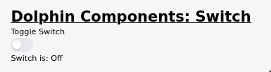
<h2>Toggle Switch</h2>
<Switch v-model="isEnabled" background="bg-black" :disable="true"/>
<p>Switch is: {{ isEnabled ? 'On' : 'Off' }}</p>
</div>
</template>
<script setup>
import { ref } from 'vue';
const isEnabled = ref(false);
</script>Screenshot
Troubleshooting
Error: "Cannot read properties of undefined (reading modelValue)"
Fix: Ensure v-model is bound to a ref variable.
Clicking doesn't toggle the switch
Fix: Ensure disable is not set to true and check for console errors.