Appearance
Toggle Component
This is a toggle button component that allows users to switch between two states, similar to a switch but with labels instead of a sliding knob.
How to Use the Toggle Component
To use this component, bind v-model to a reactive boolean variable:
vue
<Toggle v-model="isActive" />Props
| Prop Name | Type | Default Value | Description |
|---|---|---|---|
modelValue | boolean | false | The current state of the toggle (on/off). |
onText | string | "On" | Text to display when the toggle is active. |
offText | string | "Off" | Text to display when the toggle is inactive. |
width | string | "60px" | Width of the toggle button. |
disable | boolean | false | If true, the toggle is disabled and cannot be clicked. |
Example Usage
Basic Example
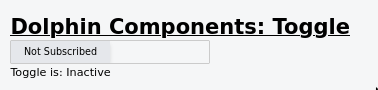
vue
<template>
  <div>
    <h2>Toggle Button</h2>
    <Toggle v-model="isToggled" onText="Subscribed" offText="Not Subscribed" width="250px"/>
    <p>Toggle is: {{ isToggled ? 'Active' : 'Inactive' }}</p>
  </div>
</template>

<script setup>
import { ref } from 'vue';

const isToggled = ref(false);
</script>
Screenshot
Troubleshooting
Toggle does not update when clicked
- Ensure
v-modelis bound to arefvariable. - Make sure
disableis not set totrue. - Check for any console errors.